Elizabeth Line diagram
Case study: Mapping Locale’s properties along London’s newest rail line
Locale is a UK-based provider of digital property management services across London and the UK.
For a marketing campaign, they needed a graphic showing exactly where their clients’ properties were located along the newly opened Elizabeth Line. The goal was to create something accurate and easy to read, while also making it visually engaging and consistent with Locale’s brand.
Information design
Client
Locale
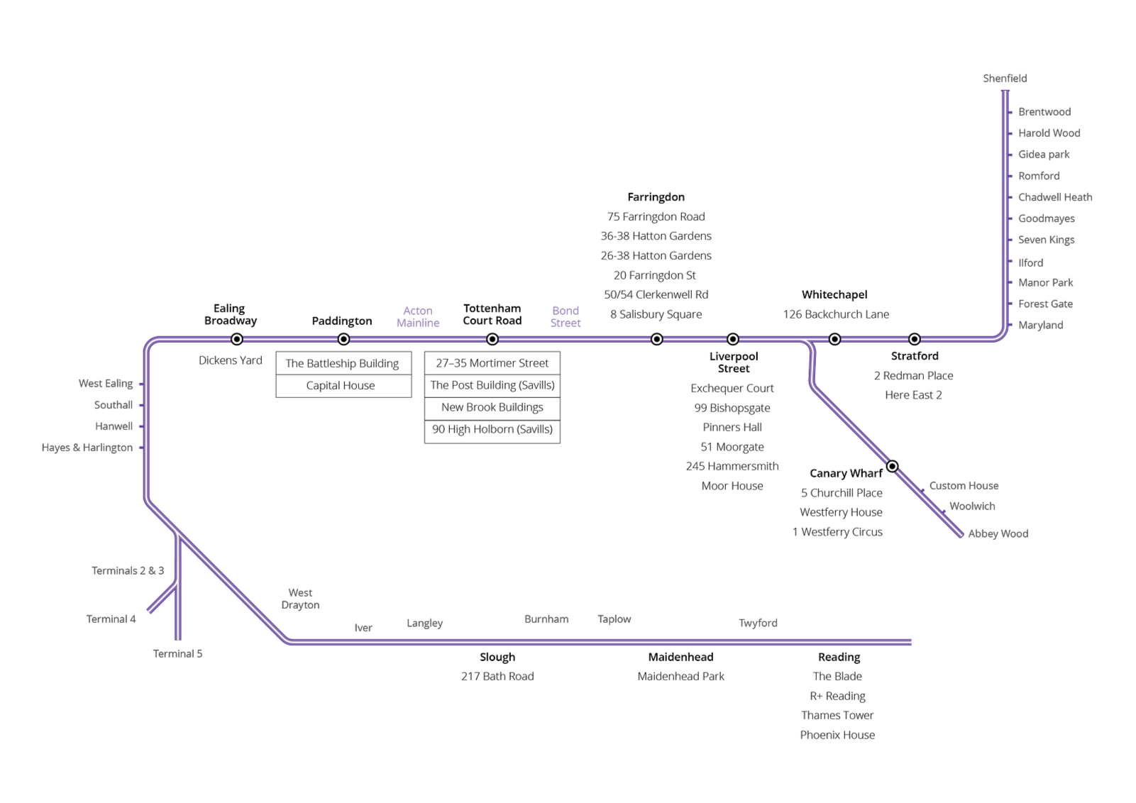
1 – Starting with the essentials
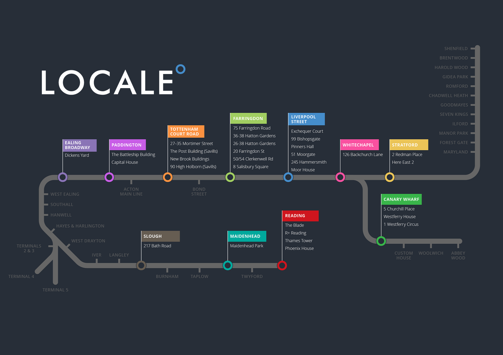
The first step was to get all the key information in place - station names, building names, and relevant property details. As soon as I laid it out, it was clear the diagram would be wide. Would it be more practical to rework the diagram so it could be printed or shared at A4 size?
2 – Making it useful
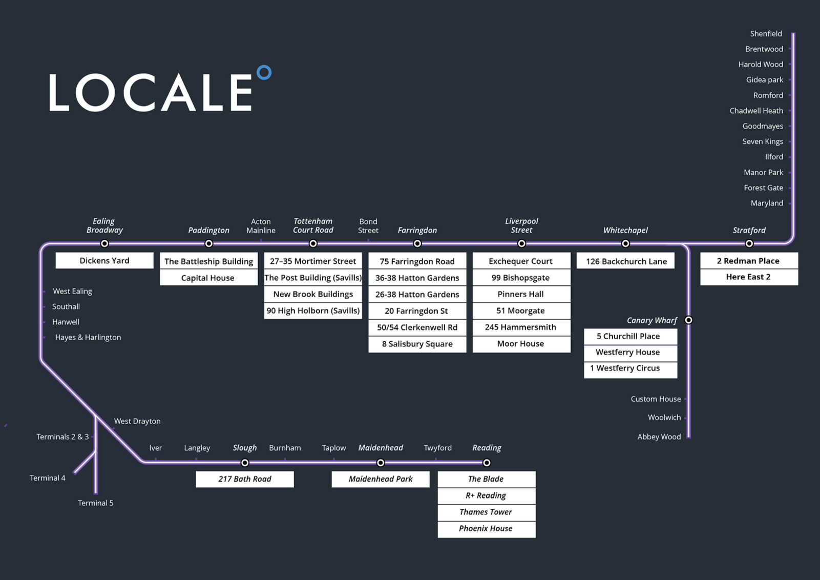
This new shape felt more usable; it’s easier to print, share, and use in presentations while still giving enough room for all the details. I also began introducing Locale’s brand colours and typography so it would sit comfortably alongside their other marketing materials.
3 – Finding the right look
The map was starting to take shape. I opted for a dark background that felt more in keeping with Locale’s branding. Highlighted stations would also stand out more clearly this way.
Also. as we’d moved away from an official TfL-style diagram, there was no reason to use the Elizabeth Line purple,
4 – First branded version
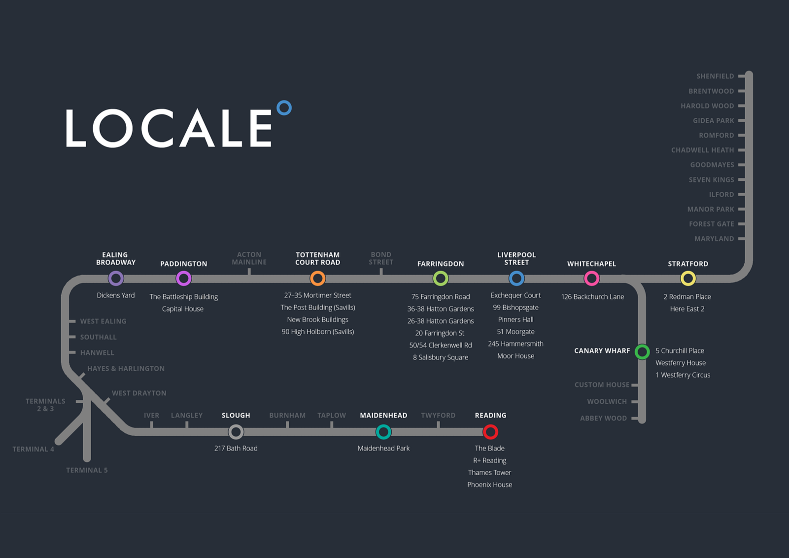
The map now looked like it belonged to Locale. The background and station highlights worked well, but the client wanted more emphasis on the stations and the properties.
5 – A rethink
Replacing the station labels with larger blocks is a simple way to make them the most eye-catching elements on the map.
The client liked this, but had a rethink - the highlighted stations should display the total square footage rather than the building names.
5 – Refining the details
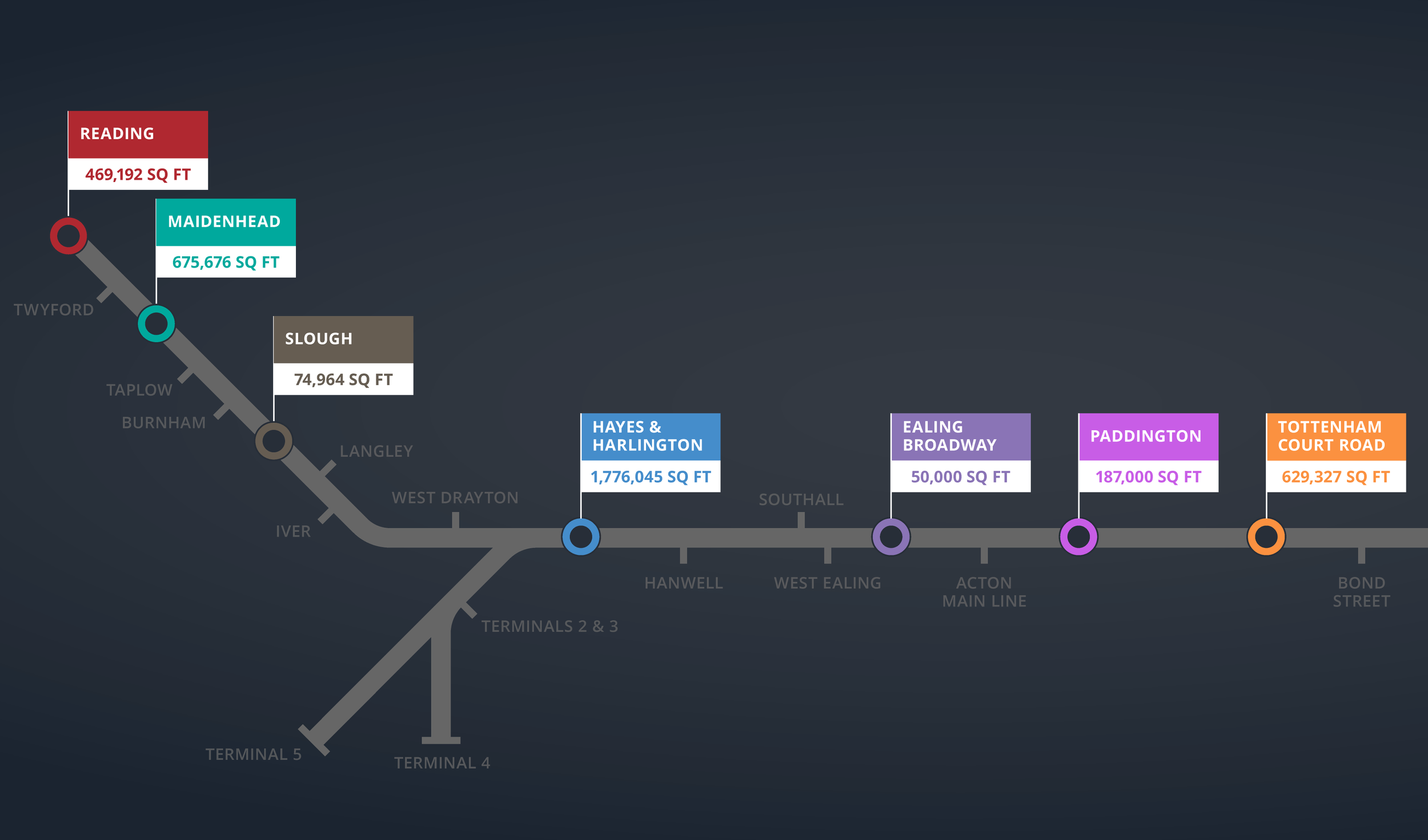
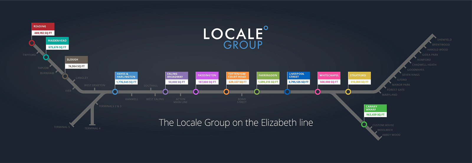
I replaced the station highlight labels with larger blocks showing total square footage, making them the most eye-catching elements on the map. This instantly made the diagram more relevant to the client’s audience — it’s not just a map, it’s a snapshot of valuable property data.
6 - Refining the details
I presented several options, and the client and I agreed that the third design was the strongest.
For presentation use, we decided to animate the final diagram, and I suggested returning to a horizontal layout — similar to the first stage — as it would work better in that format.
7 - The final diagram
The result is a distinctive, branded visual that communicates exactly what Locale wanted — a snapshot of their property portfolio, showing both the locations and the scale of their holdings along the Elizabeth Line.
