Signs of descent
Passing the time some years ago, and inspired by the smiley faces of James Joyce, I had an idea.
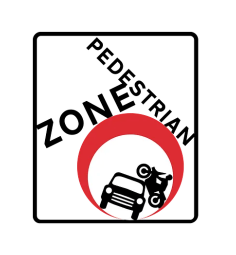
Margaret Calvert and Jock Kinneir designed the UK’s road signage system in the 1960s. The signs are such a ubiquitous feature in our lives that we hardly think of them as being designed, if we notice them at all.
The effectiveness of the system lies in the fact that the signs are almost invisible until they are needed. The fact that they are still in use today is a testament to the designers’ skill
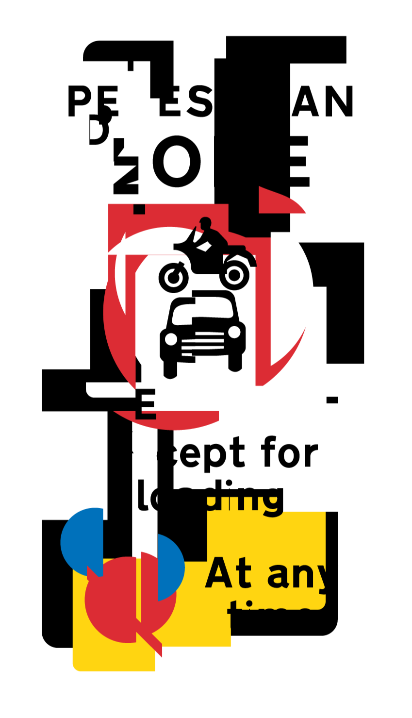
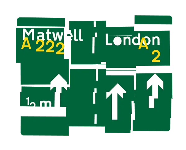
So what happens when you take these familiar and mundane symbols and distort them?
Here are a few experiments. The order and clarity of their system has unravelled, and the results feel odd. These colours, shapes and typefaces shouldn’t behave like this — what has gone wrong and caused this?