LaRive Bio
Case study: A logo for a startup Swiss biotech company
LaRive Bio is a new Swiss biotech company that needed a distinctive logo and a set of simple brand guidelines for their presentations.
The name, along with a blue and grey colour palette, had already been chosen; my job was to create something clear, professional, and memorable that hinted at the adventurous and scientific nature of their work.
Designing a logo is rarely a straight line from idea to finished mark, and for LaRive Bio, we explored a range of directions before landing on a shape that felt just right. Here’s how the design evolved, and the thinking behind each step.
Brand identity
Client
LaRive Bio
1 – First ideas
We started with a few quick sketches to explore tone and personality. These early concepts were fine as a warm-up, but nothing here felt original enough to really stand out.
That’s part of the process - get the obvious ideas out first, then push for something
2 – Playing with threes
The company was connected to three organisations, so I explored ways to weave that into the logo.
Interlinked circles and repeated shapes can be a good way to suggest connection, but in this case, it felt a little too familiar. It’s an approach that’s been done many times before, so we move on.
3 – Hexagons
Hexagons became a strong contender. They naturally suggest cells and have a distinctive, geometric character. I experimented with negative space inside the shapes to give the mark some depth. Small details like this help make a logo memorable.
4 – Refining the form
Some of the striped and sunburst versions were visually interesting, but I knew they wouldn’t hold up well at smaller sizes. A good logo needs to work everywhere, from a PowerPoint slide to the corner of a business card, so I opted for a bold, filled version that would stay clear and recognisable at any scale.
5 – The final logo
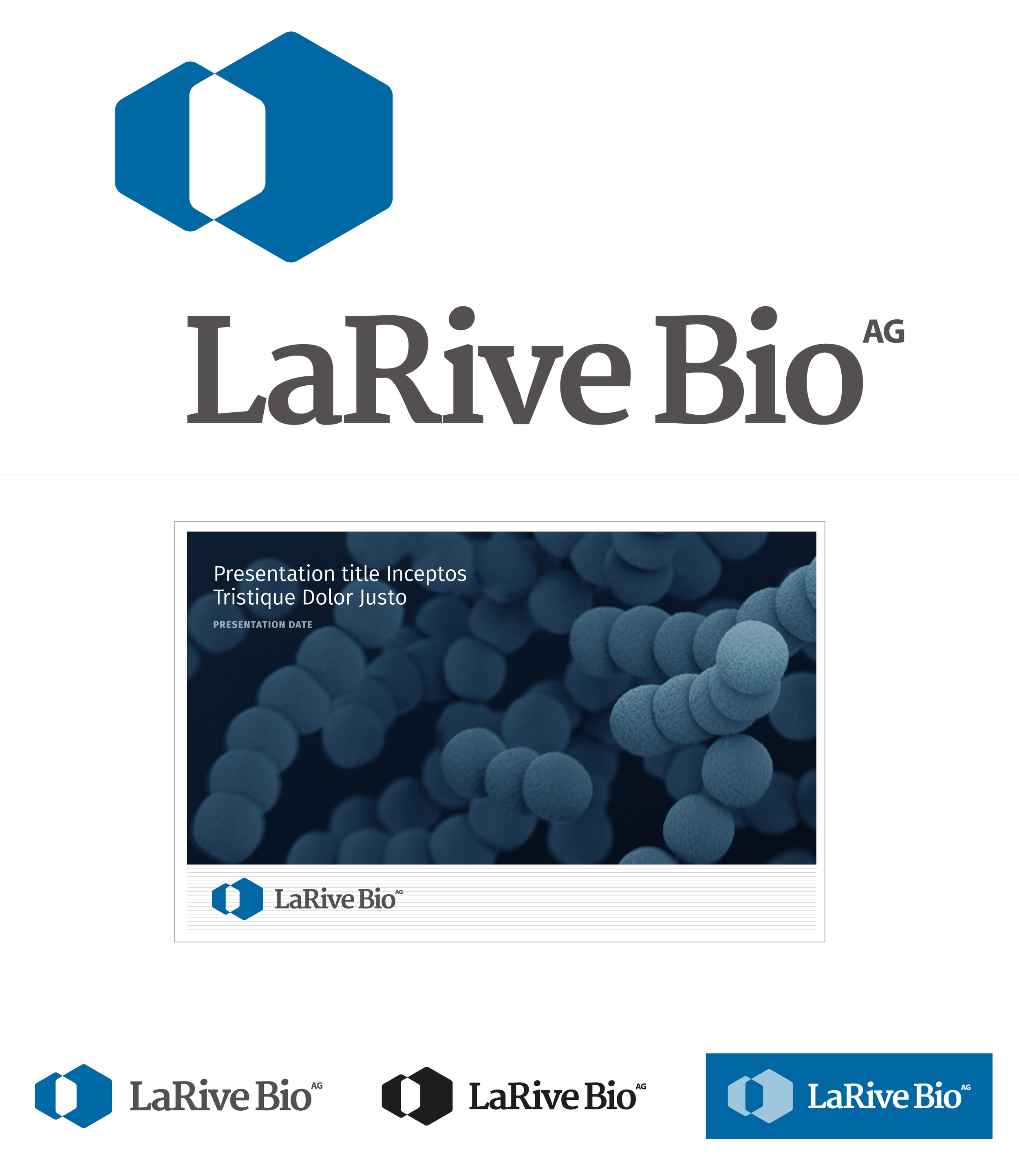
The finished design pairs the solid hexagon symbol with a strong serif typeface, giving the brand both authority and clarity.
The shape itself is simple enough to be recognisable, yet distinctive enough to feel like it belongs to LaRive Bio alone. The end result is a logo that reflects the company’s scientific focus while giving them a confident, professional identity to build on.

